Science Blog: GisSOM for Mineral Deposits-related Pattern Recognition and Gold Prospectivity Modelling in the Rajapalot Project Area in Finland
GisSOM is a standalone software application developed by the Geological Survey of Finland for the implementation of self-organizing maps (SOM) and k-means clustering on multivariate datasets. This blog describes the application of GisSOM for integration of different geoscientific datasets from the Rajapalot Au–Co project area in the northern Fennoscandian Shield in Finland. Outputs from GisSOM were further processed using an artificial neural network for mineral prospectivity modelling and the identification of drilling targets.
Mineral prospectivity analysis
Mineral prospectivity analysis aims at distinguishing areas with a high potential for hosting a mineral deposit from those with a low potential. The resulting prospectivity maps display the variation in the predicted mineral potential in a study area. The maps are used, for instance, in (i) mineral exploration targeting by mining companies and (ii) land-use planning by the public sector. The generalized workflow of mineral prospectivity analysis is illustrated in Figure 1. The first step towards mineral prospectivity analysis is the generation of several geospatial layers (in a raster format), which are indicative of the presence of a mineral deposit or a prospect. Let us call them evidence layers, because they provide evidence of mineralization. The evidence layers represent features that are derived from primary geoscientific data such as bedrock geology (e.g., lithology, folds, faults, lineaments and such others), geophysical measurements and geochemical data. For instance, the calculation of distances from a fault generates an evidence layer mapping the proximity to faults. Thus, the proximity to faults evidence layer maps the quantity ‘distance’ between each data point (pixel) in the image and the nearest fault trace. These distances are given in map units such as metres or kilometres, depending on the scale and spatial resolution of the data. In addition to ‘proximity to faults’, many other evidence layers are used in mineral prospectivity analysis, for example geochemical concentrations, magnetic anomalies, densities of fault intersections and many others. All the evidence layers together form a multivariate dataset, where each layer is an input variable. Hence, each pixel is a feature vector whose elements represent all the different evidence layers. Commonly, about 10–15 evidence layers are generated for a mineral prospectivity exercise. The collective visualization of so many layers together in the three-band RGB colour space of an image is not possible. Hence, this is where SOM is used as a data integration method, for fast and efficient identification of patterns from the evidence layers that can be related to mineral deposits.
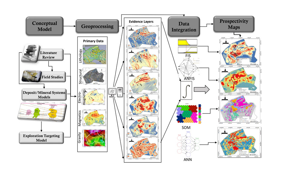
Self-organizing maps for prospectivity analysis in the Rajapalot area
To demonstrate the application of SOM to mineral prospectivity analysis, we present an example case study of gold prospectivity modelling. The study area is the Rajapalot Au–Co project in the Lapland region in Finland. It is located ~35 km west of Rovaniemi. High-quality exploration datasets are available in this area for use in prospectivity analysis. In this study, we aimed to identify drilling targets in the Rajapalot area. Thus, using the primary geoscientific datasets, we generated fifteen evidence layers, each representing either the pathways or trap component of the epigenetic-hydrothermal gold mineral system in the study area.
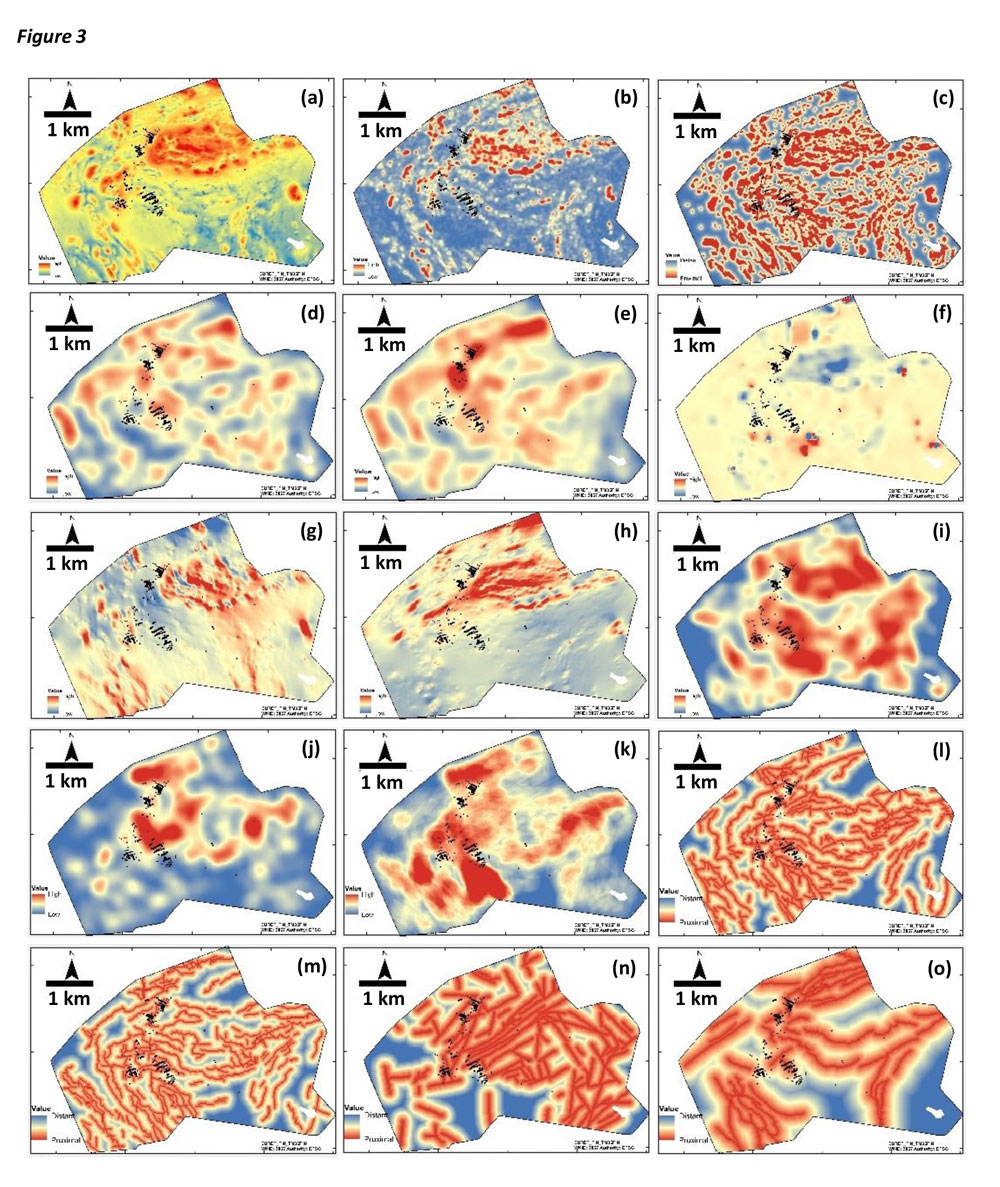
Figure 2 presents all the evidence layers generated as representations of the geological evidence related to mineral deposits in the study area. The small black dots in the evidence layers are the surface projections of drill core sections with an anomalously high gold content. We refer to these as mineralized drill core sections. It is difficult to analyse each of the fifteen evidence layers individually for the values corresponding to the mineralized drill core sections. Moreover, we are unable to quantify the inter-relations between all the evidence layers and the mineralized drill core sections. Hence, we used SOM to represent this multivariate dataset (15 dimensions in feature space) on a 2D SOM lattice and identify the hidden patterns in the data.
In a previous blog post, GisSOM for Clustering Multivariate Data – Self-organizing Maps | GTK, Johanna Torppa provided an intuitive presentation of a manual SOM generated from a bucket-full of small magic stones of various colours, sizes and shapes. SOM, when applied to geological data, functions in the same way as this magic-stones example, the only differences being that:
1. the bucket is replaced by a geodatabase,
2. the magic stones are replaced by the data pixels in the evidence layers,
3. instead of the size, shape and colour values of the magic stones, the input variables are the numerical values presented in each evidence layer, and
4. the grid is drawn not on sand but on our computer screens.
Since the methodology is the same, and has already been described in previous blogs (e.g., GisSOM for Clustering Multivariate Data ‒ Multivariate Clustering and a Glance to Self-organizing Maps | GTK, GisSOM for Clustering Multivariate Data – Self-organizing Maps | GTK), we can move straight to the results and the patterns identified in this study.
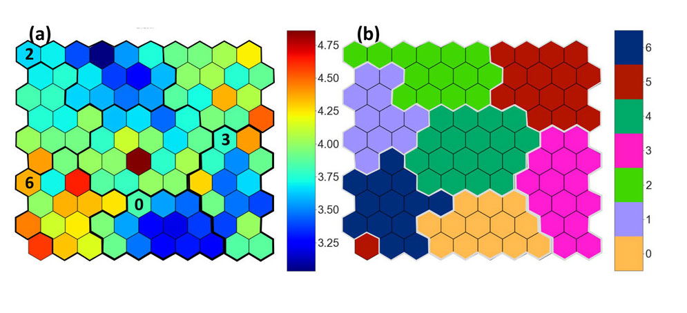
The foremost informative result generated from the SOM method is the U-matrix (unified distance matrix) of SOM (Fig. 3a). The U-matrix gives a visual and quantitative representation of the topological relationship between the SOM nodes. It is the average of the Euclidean distances between the SOM node and it neighbours in a defined neighbourhood. Each SOM node is a cluster of data points. All the data points grouped together in a particular SOM node have least variability among themselves. Furthermore, as the arrangement of SOM nodes preserves the topology, the nodes close to each other in the SOM grid are generally more similar to each other in the feature space than those far apart. All of this can be visualized in the U-matrix. Low U-matrix values indicate similar data points in the given neighbourhood. These domains could be separated by SOM nodes with high U-matrix values, thus indicating a boundary between the different populations. These boundaries become more distinct as the size of the SOM increases. Hence, visual interpretations of the U-matrix of the SOM facilitate the identification of distinct populations in the input dataset. In the example of our case study, in Figure 3a we see the U-matrix. Using k-means clustering, similar nodes can be further grouped together (Fig. 3b). Cluster IDs are indicated in Figure 3b. In the U-matrix, we observe that Cluster 0 and Cluster 2 have low U-matrix values for the nodes grouped in the respective clusters. Cluster 3 is not as homogeneous as Clusters 0 and 2. Nodes grouped in Cluster 6 are most dissimilar from each other.
SOM and patterns related to mineral deposits
Until now, we have seen only the arrangement of data vectors in the SOM lattice and the corresponding clusters. In this section, let us look into the following question: Do the U-matrix and the clusters in SOM tell us anything about their relationship with mineral deposits and occurrences? To answer this question, let us do the following:
1. Transfer the SOM nodes to geospatial domains, according to the groupings obtained from the k-means clustering method (Fig. 4a);
2. Identify the percentage of mineralized drill core sections (i.e., the percentage of the black dots) in each cluster in geospace (Fig. 4b).
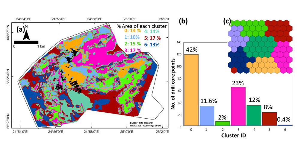
The data points assigned to each SOM node when mapped to the geospatial domains can facilitate the visualization of their spatial distribution. We can further assess how indicative they are of mineralization-favourable environments by checking the proportion of mineralized drill core sections contained within each cluster (Fig. 4b).
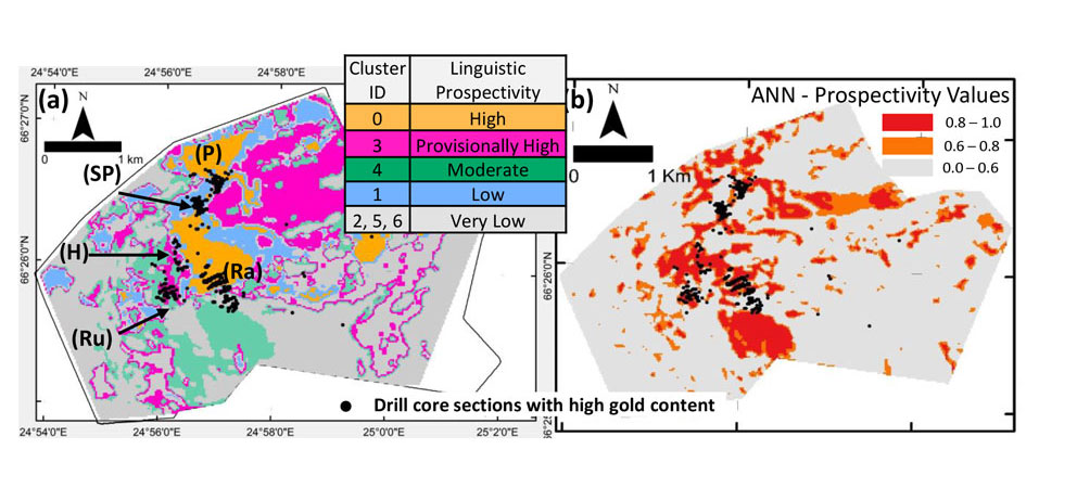
Figure 4b illustrates that Cluster 0 has the highest percentage of the mineralized drill core sections. It contains 42% of mineralized drill core sections within 14% of the area. It is followed by Cluster 3, containing 23% of mineralized drill core sections in 17% of the area. Clusters 1 and 4 each have about 12% of mineralized drill core sections, and the remaining ~11% lie within Clusters 2, 5 and 6 together. From the above simple statistics, we can easily conclude that Clusters 0 and 3 are the most suitable for the presence of ore mineral occurrences and, if our SOM was on the right trail, even mineral deposits. The best way to confirm this would be to conduct further exploration and drilling activities in areas mapped to Clusters 0 and 3.
Isn’t it interesting that an unsupervised machine learning method has managed to group 65% of mineralized drill core sections in about 31% of the study area? This can get us thinking about the following questions: Was it by sheer coincidence that Cluster 0 managed to contain 42% of mineralized drill core sections? Where are the patterns? And moreover, how do we get to see the patterns that are related to mineral deposits, if drill core data were not even used for SOM calculations? Curiosity is a distinct quality of human beings. Thankfully for us humans, even a highly learned and most intelligent machine would be lacking this trait.
However, it is this curiosity that also creates doubts in our minds about the results, particularly when the results appear to have been produced by a black box. The following section explains why and how the SOM nodes assigned to Cluster 0 were able to capture the mineralized drill core locations, without even using the drill core data. This is all enabled by mathematics and the enhanced computational capabilities of modern machines. Add to this the relentless and dedicated efforts of (i) the python community for all the open-source machine learning libraries, and (ii) GTK in building the open-source GisSOM application (https://github.com/gtkfi/gisSOM) with an easy-to-use user interface, thereby simplifying the implementation of SOM for us.
So, getting back to the SOM black box, let us try to unbox the black box and add some colours to it. We first investigate the SOM codebook vector weights of the k-means clusters (Fig. 5) to identify deposit-related patterns. Using cluster-wise boxplots (e.g., Fig. 5) for each input variable, we can collectively infer the ‘patterns’ captured by the SOM nodes. The SOM nodes mapped to Cluster 0 have high SOM weights for the following evidence layers: 1) the density of geological contacts (Fig. 5a), 2) the density of lithological contacts weighted by the relative competence contrasts (Fig. 5b) and by reactivity contrasts (Fig. 5c), 3) the densities of the intersection zones of structures (Fig. 5d) and 4) the density of structures weighted by their sinuosity (Fig. 5e). Low SOM weights in Cluster 0 occur for the evidence layer mapping the distances to antiforms (Fig. 5f). In the corresponding boxplots, it is easy to distinguish Cluster 0 from the other clusters. The values in these evidence layers indicate the presence of (i) favourable structural settings, i.e., pathways and physical traps, and (ii) favourable host assemblage, i.e., the chemical traps facilitating the enrichment of gold in the host rocks. Hence, SOM nodes grouped in Cluster 0 are interpreted to represent structurally as well as chemically favourable host rocks. So, now we have successfully visualized and identified the patterns in the evidence layers that can explain the presence of 42% of mineralized drill core sections within the 14% of study area mapped to Cluster 0.
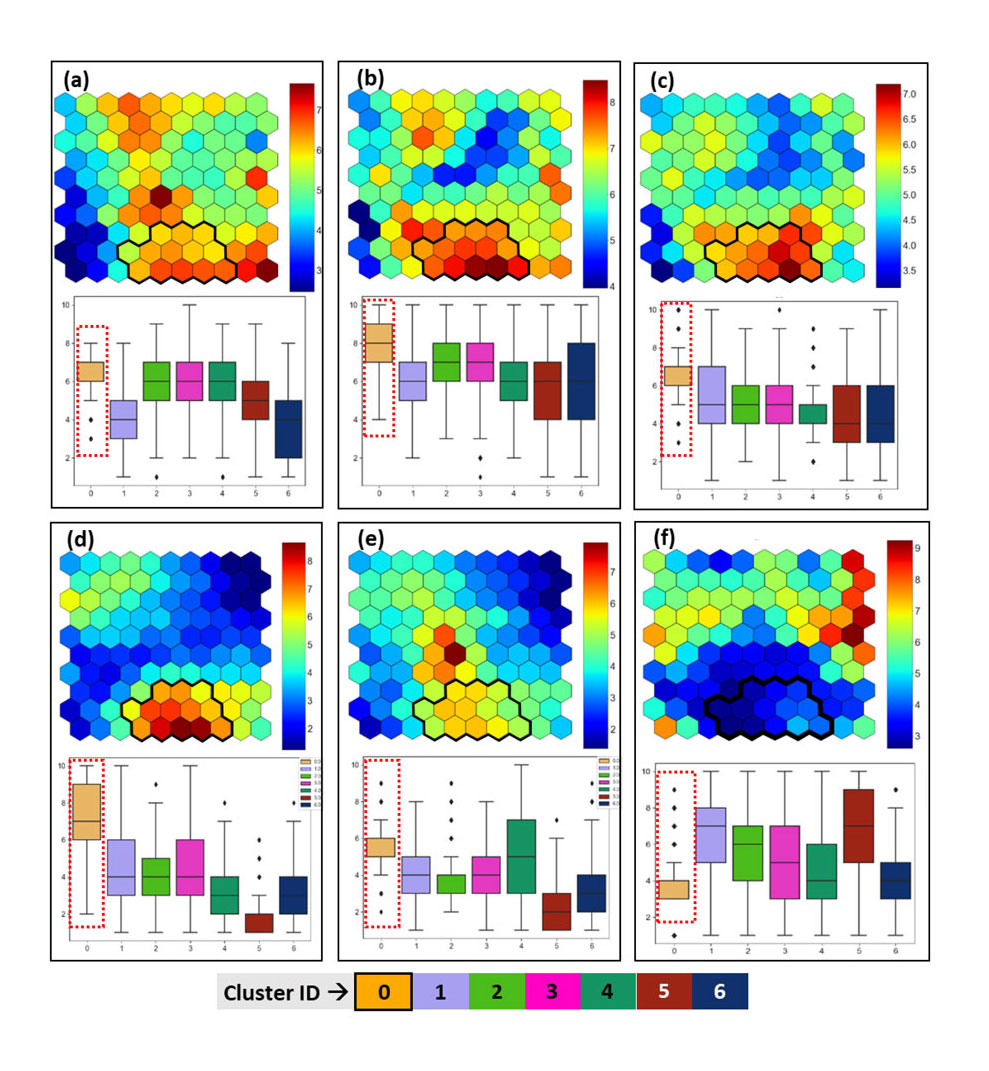
Similar inferences can also be made for other clusters, not all of which (much to the disappointment of our reader) can be presented in this blog. However, the full study (Chudasama et al. 2021) has been submitted to the journal Ore Geology Reviews, and readers can access all the relevant information there once the article is published. Based on the collective inferences from the SOM nodes, k-means clusters, box plots and the percentage-wise distribution of drill core data in the clusters, a proto-prospectivity map was generated with linguistic prospectivity classes (Fig. 6a). For further quantification of the prospectivity values, we trained an artificial neural network (ANN) on the SOM nodes. This finally produced a relative prospectivity map for gold enrichment in the Rajapalot project area (Fig. 6b).
The Takeaways
To summarize, in the above prospectivity analysis study, we have demonstrated that:
1. SOM is an effective method for generating a low-dimensional (usually 1D to 3D) representation of multivariate geoscientific datasets.
2. Being an unsupervised method, it can be implemented independent of the data on mineral deposits and occurrences.
3. From the SOM, patterns are identified in the input-data feature space, considering only the distribution of the geoscientific input variables and neglecting the spatial aspect.
4. The SOM weights and other data visualization graphs, such as box plots, can be used to relate these patterns to the mineral deposits and hence interpret the geological aspects of the prospective SOM nodes in the corresponding evidence layers.
Some important details
The research related to this blog has received funding from the European Union’s Horizon 2020 research and innovation programme under Grant Agreement No. 776804 – H2020-SC5-2017 NEXT – New Exploration Technologies.
Mawson Gold Ltd holds the exploration permits for the Rajapalot project area. High-resolution exploration datasets were provided by Mawson for use in this study.
The figures and graphics presented in this blog are extracted from a manuscript submitted to Ore Geology Reviews and are subject to copyright.
And some more
Interested in running your multivariate datasets in GisSOM? You can download GisSOM from GitHub.
Want to read previous blogs? Here they are:
– GisSOM for Clustering Multivariate Data ‒ Multivariate Clustering and a Glance to Self-organizing Maps | GTK
– GisSOM for Clustering Multivariate Data – Self-organizing Maps | GTK
Reference
Chudasama, B., Torppa, J., Nykänen, V. & Kinnunen, J. 2021, under review. Target-scale prospectivity modeling for gold mineralization within the Rajapalot Au-Co project area in northern Fennoscandian Shield, Finland. Part 2: Application of self-organizing maps and artificial neural networks for exploration targeting. Submitted to Ore Geology Reviews.
Text: Bijal Chudasama and Johanna Torppa
Bijal Chudasama is a Research Scientist in the Information Solutions Unit at the Geological Survey of Finland (GTK). She completed her PhD on genetic, geochemical and mineral prospectivity modelling of calcrete-hosted uranium systems in Namibia and Western Australia in 2019 from the Indian Institute of Technology, Bombay, India. In the same year, she joined GTK as a postdoctoral researcher. At GTK, she works on different themes of geoinformatics research such as geoscientific data analysis and the application of machine learning methods to mineral prospectivity modelling from regional to prospect scales, targeting different types of mineral deposits.
Johanna Torppa is a 44-year-old Senior Scientist in the Information Solutions Unit at the Geological Survey of Finland (GTK). While completing her PhD degree in astronomy in 2007, she studied the inversion of shapes and rotational properties of asteroids from time sequences of their integrated brightness. After her PhD, she spent eleven years as a freelance researcher, working in biology, astronomy and geology-related projects. In autumn 2018, she became a senior scientist at GTK. She is currently developing methods and tools for multivariate data analysis related to mineral prospectivity modelling and surface soil types.