GisSOM for Clustering Multivariate Data – Self-organizing Maps
In GisSOM for Clustering Multivariate Data ‒ Multivariate Clustering and a Glance to Self-organizing Maps, the first blog of this three-part blog series, multivariate data and multivariate clustering were described, and a quick overview to some results from self-organizing maps (SOM) was given. In this blog, we take a look at how SOM works.
Self-organizing Maps
As described in the first blog, SOM is a grid where similar data points are arranged close to one another. This representation allows using various handy ways to process and interpret the dataset. Just like many other multivariate data-analysis methods, SOM can be used to analyze a dataset with, in principle, any number of variables and data points; the upper limits are set by the computing resources. In geoscientific research, the number of variables strongly depends on the subject of the study. It can be in the order of tens for geophysical and geochemical data and hundreds or even thousands for spectral data. The number of data points can vary as well from tens to millions and above.
The number of variables and data points affects the way we interpret the SOM result. In this blog, we will study two example datasets. The first is a set of spectra for mineral samples. This dataset consists of eleven data points (mineral samples) with more than 150 variables (the measured spectral values). The other example is the satellite image dataset described in the previous blog. The image has about 650 000 data points (pixels) and three variables, the R, G and B colors.
Before presenting how SOM is used in clustering our datasets, let’s take a side trip to something more concrete to describe SOM and how the data is organized on SOM.
A Short Presentation of Manual SOM
As the name “self-organizing-map” reveals, SOM is a map. A grid of points. Or nodes, as we say in machine learning language. Think of having collected a bucket-full of little magic stones of various colours, sizes and shapes. To be exact, you have 10 000 stones. You would like to get an idea of what colours, sizes and shapes your sample of stones generally represents. One option would be to empty the bucket on the ground and stare at the 10 000 little stones, trying to figure out what they are like. “Toys in the attic”, a bypasser would say. So, instead, you put a little more effort in processing your stone data. You draw a grid on the sand, say, of size 10×10 squares, and randomly pick stones from the bucket, placing one stone in each square. Now you have a grid of 100 stones, but they are totally randomly located on your grid, thinking of their color, size and shape. It is still difficult to understand what are the representative features of the stones on the grid. In addition, they are a very small subsample of your total sample, and do not necessarily represent the properties of the entity. If you organized the stones on the grid so that similar stones are close to one another and if you could somehow incorporate information from all the stones in the bucket, it would be possible to see the major features that the stones of your sample represent.
To accomplish this, you do as Kohonen (Kohonen T., 2001, Self-organizing maps.) has taught us. You take one stone from the bucket and search for the stone most similar to it on the grid. Lets call this stone on the grid the “best matching unit” (BMU). Now you bring the stone that you took from the bucket close to the BMU. Since your stones are magic stones, the BMU changes its colour, shape and size a little bit towards the stone you brought close to it. The magic affects also stones near the BMU on the grid, but the further a stone is from the BMU the less their properties are changed. When the change is done, you place the stone taken from the bucket aside, in another bucket for instance. Then pick a new stone from your first bucket, do the BMU search again and apply the magic change to the new BMU and its neighbours. This is how SOM works. When you have presented all the stones from the bucket several times to the stone grid, the 100 stones on the grid represent the properties of the 10 000 stones in your bucket and are arranged so that similar stones are close to one another.
In the above example, you used your vision to find the best matching stones. If you want to save time, and generate a SOM for the stones using a computer software, you will figure out some parameters describing the stones, and present them to the software as numeric variables. For describing the shape, size and colour of the stones 7-10 parameters should be enough. To find the difference between a pair of stones, the computer calculates the difference between the set of variables you have defined. To change the properties of the stones near the BMS on the grid, the SOM software uses simple calculations to change the values of the variables of the BMS and its neighbours. The data provided to the computer software is a numeric table, where each stone possesses, for instance, one row and the variables describing its properties are placed in columns on this row. The SOM software takes the information on one row (stone) at a time, and compares it to the information of the items (stones) already placed on the SOM grid. To select the initial items to be placed on the grid, one can pick, for instance, a random sample of items from the table and place them on the SOM grid, just like you picked a random sample of 100 stones from the bucket.
Mineral Spectra Example
Now that you understand how a SOM of stone properties is computed, let’s take another example. In the NEXT project, Yong-Hwi Kim from the University of Lorraine, used GisSOM to analyze mineral spectra. The mineral dataset is a list of spectra for the measured mineral samples; a table with one sample on each row and observed quantities in columns (Table 1). Samples represent pure minerals, and the idea is to see how these samples are organized on a SOM, and to find out if SOM can be used to group similar samples together, based on their spectra.
Table 1. Example table representing a spectral dataset, where intensities at Nwl wavelengths have been measured for Ns samples.
| Sample | Wavelength 1 | Wavelength 2 | … | Wavelength Nwl |
| Sample 1 | 0.2 | 0.2 | … | 0.58 |
| Sample 2 | 0.24 | 0.3 | … | 0.65 |
| … | … | … | … | … |
| Sample Ns | 0.1 | 0.3 | … | 0.7 |
Measurements were carried out to 11 pure mineral samples representing six different minerals using X-ray fluorescence, Raman, X-ray diffraction and Fourier transform infra-red spectroscopy. The dataset containing all the measured parameters has more than 150 variables. This is way too much to manually group similar samples, and numerical clustering has its place here. Although, a geologist might say: “Such a waste of time! I would recognize the minerals from the original rock samples in one second.” But this is another story.
Let’s say that this is one of the cases where we need numerical clustering, so we gave the dataset to GisSOM and ran it. Compared to the stone example above, this mineral data consists of way less data points (11 vs 10 000) and way more variables (>150 vs 7‒10). These differences do not affect the actual SOM computation, but they do affect the way we want to investigate the results: in the case of the mineral dataset, we are not that much interested in the distribution of the variable values on SOM, but rather on the locations of the data points on SOM. With the stone data it was the other way around.
When GisSOM was run, the 11 mineral samples quite quickly found their place on the 10×10 SOM grid, and extended their properties to the neighbourhood each time they were represented to the SOM ‒ like drops of watercolour spreading on a wet paper. Although only a small portion of SOM nodes was finally populated by a data point (11 data points vs 100 nodes), all SOM nodes had learned during the training and, in the end, represented spectral values similar to the sample minerals. To better see which minerals each node on the final SOM represent, the SOM nodes (each comprising the >150 variables) were further clustered using the k-means clustering method. It was then easy to colour the SOM to show the regions representing similar variable values (Figure 1).
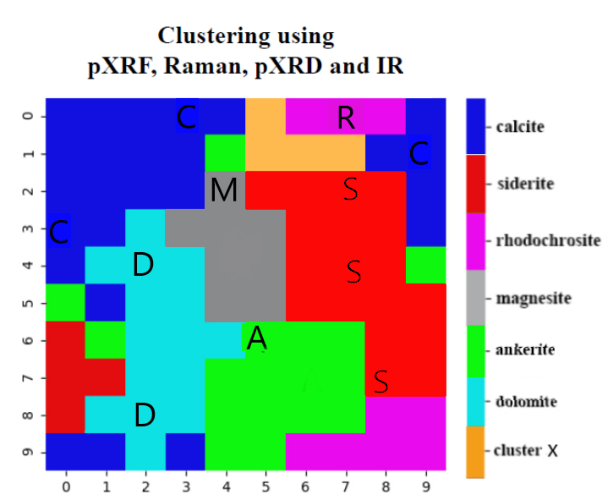
As mentioned in the previous GisSOM blog, clusters do not have a predefined meaning. In our mineral dataset, all the data points have a predefined class, but it was not used in the clustering process. We can, however, show the classes on the final SOM, since we know where each data point is located. This mineral spectra example shows the usefulness of SOM for extending the information in the available dataset to data of yet non-existing samples. One can assume that all the cells on SOM that belong to the same k-means cluster represent samples of similar composition. For instance, the entire red region on the SOM in Figure 1 represents siderite even though only three siderite samples are available in the dataset, and, thus, only three red SOM nodes are assigned a sample. The spectral values of the rest (17) of the red cells on SOM represent other kinds of spectra typical for siderite samples.
Comparison of Mineral SOM to Satellite Image SOM
Since we already described the satellite image SOM in the first blog, let’s now concentrate on comparing the SOM analysis of mineral data to that of the satellite image dataset. Notice the small number of variables in the satellite image data, only three, compared to the over 150 in mineral spectra. Also notice the large number of data points, i.e. 650 000 pixels, compared to only 11 mineral samples. In the SOM generated from mineral samples, SOM size was an order or magnitude larger than the number of samples and most SOM cells were assigned no data points.
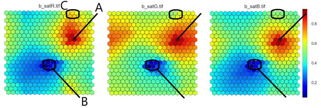
For the satellite image, the idea of SOM is a bit different. On the one hand, the size of SOM is smaller than the number of data points and more than one data point is assigned to each SOM node. Thus, in the satellite image SOM, each SOM cell itself is already a cluster of data points, just like in the stone sample case presented earlier. On the other hand, small number of variables allows visual inspection of each parameter SOM separately (Figure 2). By comparing the distributions of the R, G and B values on the SOM, a general understanding of the colours in the image can be obtained. As explained in the previous blog, the overall colour of the satellite image obviously is green, but there are very dark (B) and also white (A) regions. There are also areas where red colour dominates (C).
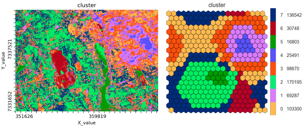
The SOM result can be further clustered in order to divide the data set into a moderate number of clusters (Figure 3). The clusters here do not reveal yet unobserved values, since all the SOM nodes are populated with data points.
The heart and soul of SOM is the SOM grid, where the input data is arranged. SOM provides a useful outlook to the data. It also helps to figure out how the data is structured and to see if there are distinguishable patterns in the data. There are many ways to visualize SOM result, like the difference of variable values between neighbouring SOM nodes (reveals cluster boundaries), and the number of hits per node (gives information on the distribution of the original variable values in the input data).
Almost there
Now we have described briefly how SOM works and demonstrated its use with three different types of datasets. We considered the role of the number of data points, number of variables and SOM size in the interpretation of the SOM result. How to do SOM analysis in practice then? This question will be answered in the last blog of the series, GisSOM for clustering multivariate data – GisSOM, where an introduction to the software will finally be given.
Previous blog post in this three part series: GisSOM for Clustering Multivariate Data ‒ Multivariate Clustering and a Glance to Self-organizing Maps
In case you already want to take a look at GisSOM, you can find it and download it at GitHub.
The research related to this blog series has received funding from the European Union’s Horizon 2020 research and innovation programme under Grant Agreement No. 776804 – H2020-SC5-2017 NEXT – New Exploration Technologies.
Text:
Johanna Torppa, Senior Specialist, Information Solutions, Geological Survey of Finland, johanna.torppa@gtk.fi
Reference:
Kohonen, T. 2001. Self-organizing maps. Springer.