GisSOM for Clustering Multivariate Data ‒ Multivariate Clustering and a Glance to Self-organizing Maps
What are multivariate datasets and self-organizing maps? And what do they have to do with geological data and machine learning? Johanna Torppa, Senior Specialist at GTK, explains in a three-blog series the possibilities of GisSOM software in the visualization and analysis of geological datasets.
This blog was intended to present the GisSOM software, but its length exceeded the maximum feasible length of any kind of a blog before the word GisSOM was even mentioned. The only solution was to divide the blog into a series of three blogs of which this is the first one. Here we, as the topic already reveals, describe multivariate data and multivariate clustering, and take a glance to what can be done with self-organizing maps.
Multivariate Data
Consider, that we want to divide a satellite remote sensing RGB image (photograph) into subareas based on color. Our aim may be, for instance, to roughly separate water, clouds, forest and fields from each other.
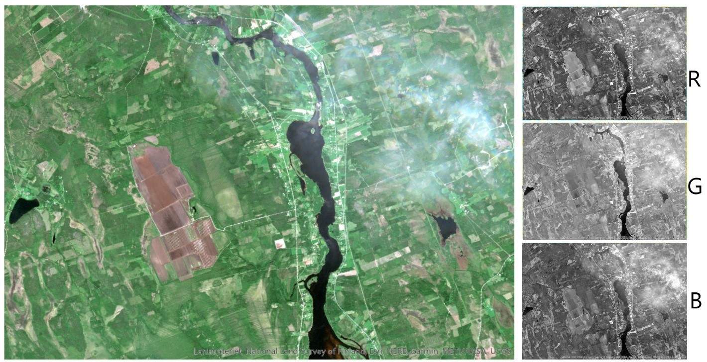
Our image (Figure 1) can be thought of comprising a set of data points (pixels) each having three variables representing reflected solar radiation in red, green and blue bands of the electromagnetic spectrum. If you think this is obvious, you should be able to easily generalize this to having a larger number of variables for a pixel. Any dataset comprising more than one variable at each data point, is called a multivariate dataset. In geoscientific research, the variables usually are something that we cannot see, like magnetic field intensity, electric conductivity, concentration of different geochemical elements, pH, or whatever you may imagine. Any three of these variables could be visualized using the RGB color model – or even four variables by applying the transparency channel alpha. Most often, however, we have more than three or four variables, and direct visualization of all the variables using colors is not possible. The satellite image in Figure 1, with three variables, was chosen as one example dataset in this blog since the ability to visualize the variables helps understanding what is happening behind the scenes in the data analysis. All the methods discussed, however, can directly be applied to a dataset with any number of variables.
Another reason to use a satellite image as an example, is its spatial nature: data points with spatial reference can be visualized as a map, giving data points a clear context and, again, facilitating understanding what is happening to the data. We will, however, not be considering spatial data analysis methods. When dealing with spatial data, the spatial coordinates will be treated as passive parameters that are kept connected to each data point whatever happens to it, but they are not used in the data analysis.
Multivariate Clustering
In the very beginning of this blog, we proposed an idea of dividing the satellite image to subregions based on color. For solving this problem, we have to dive into the field of clustering. A cluster is a group of similar data points and, contradictory to a class, does not have a predefined meaning or definition of representative variable values. A cluster scheme is specific to each individual dataset. This means, that if we take two random sub-samples of a dataset and cluster them separately using the same clustering method, we get two different clustering results. How different the results are, depends on the data: if the data contains clusters by nature, results are similar, while clustering sub-samples of a more or less uniformly distributed dataset is likely to produce totally different results.
Real-life geoscientific datasets do not often contain clearly separable clusters. There are a large number of clustering techniques for multivariate data, some of which require a priori knowledge of the number of clusters, and others that find the optimal number in the clustering process. Even if this “optimal number of clusters” sounds promising, it does not mean “universally optimal”, but optimal using the selected method and process parameters. Actually, there rarely exists a single correct clustering scheme. In other words, there is no correct number of clusters or way to assign the data points in different clusters. Often one needs to run clustering several times, possibly using several clustering approaches, to map the possible solutions. Further analysis on the clustered data reveals how different clustering schemes serve in solving your research problem.
As an example of a real-life clustering problem, let’s define subareas of differing colors in our satellite image (Figure 1). We apply ArcGIS’s Iso Clustering tool with 12 clusters.
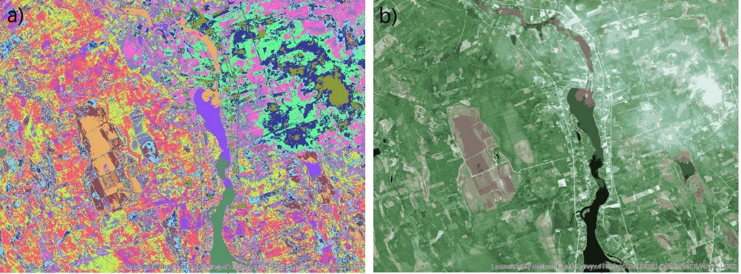
In Figure 2, the clustered data points are mapped back to geospace. In addition to the R,G and B values, the clustered data has a fourth variable, the cluster index, which is used to define the color of each pixel in Figure 2a. In Figure 2b, pixels are coloured using the representative R, G and B values for each variable in each cluster, obtained from the clusterng process. Although the cluster colours represent the original data (Figure 1) fairly well based on visual inspection, this particular clustering result is not the only feasible one. We could have more or less clusters, and data points could be allocated to the clusters somewhat differently.
To estimate the goodness of the clustering scheme, we can use a number of different metrics that measure the spread of the variable values within each cluster and the difference of the variable values between each pair of clusters. However, just like different clustering methods produce different cluster schemes, also different goodness of clustering metrics produce different results. Making the choice of which cluster scheme should be chosen as the final result or for further data analysis is by no means simple. One powerful method to help in obtaining a stable clustering result, and for visually representing the data and clusters even for a large number of variables, is the self-organizing maps method (SOM). SOM is effective also for simplifying a large data set or for predicting values for yet unobserved data.
Self-organizing Maps
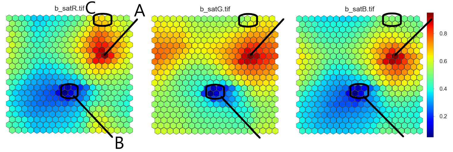
In brief, self-organizing maps (= SOM) are grids on which data points are organized so that similar data points are close to one another. As SOM is not a spatial analysis method, it does not matter whether the data points are close to or far from each other in the geographic space, or whether the data points are spatially referenced at all. The SOM coordinates have nothing to do with geographic coordinates. In this blog, we take a very quick look to what SOM does to a dataset, while how SOM does it is described in another blog, GisSOM for Clustering Multivariate Data – Self-organizing Maps. We use the satellite image dataset as an example and perform SOM analysis using the GisSOM software developed in the Horizon 2020 NEXT project.
In the satellite image data, each pixel is a data point with three variables. In this exercise, we used a 20 x 22 hexagonal SOM grid, where all the data points were organized, similar points close to one another. The three variables (red, green and blue) can be represented on separate SOMs, as shown in Figure 3.The same node (i.e. location) on each variable’s SOM contains information on the same data points. We can directly see, for instance, that the maximum values of all the variables occur at the same SOM node (A) and, thus, in the same image pixels. The same applies to the smallest values of the variables (B). This means that there are no bright red, green or blue regions on the image, but the change of variable values go more or less hand in hand. However, across the entire data set, green slightly dominates everywhere else but in the data points represented by SOM’s region C where red dominates in a few SOM nodes. This quick look at the parameter SOMs gives you a general idea of the colours in your image.
The SOM result can be further clustered in order to divide the data set into a moderate number of clusters. With GisSOM’s k-means clustering tool, the best clustering result was obtained with eight clusters (Figure 4). By visual inspection of the final SOMs showing the variables (Figure 3) and clusters (Figure 4b), it can be seen that the cluster scheme does represent the patterns in the original dataset fairly well, since the data is well organized on SOM, and there are clearly distinguishable patterns. SOM also reveals which clusters can be mixed. Clusters 4 and 5 are most likely separable, since they are far from each other, and there are nodes representing other clusters in between them. Clusters 4 and 1 are next to each other, and most likely have some overlap.
The possibility to produce geographic maps (Figure 4a and Figure 5a) is not necessary for interpreting the SOM results but it is an essential and very useful feature of the GisSOM software, developed for facilitating further interpretation in case of spatial data.
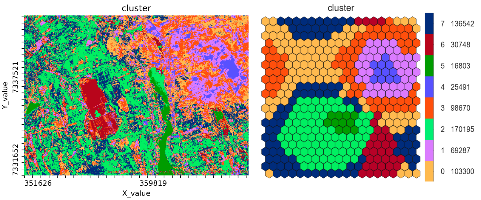
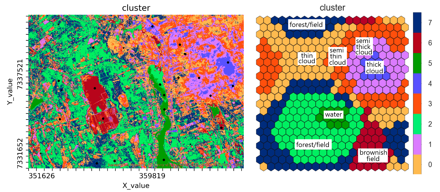
The colours in Figure 4 are just based on the cluster number, which is at this stage the only way to identify the clusters. To give a deeper meaning to the clusters, like our desired classes “water”, “forest”, “cloud” and “field”, we should have training data, i.e. data points with a known class (Figure 5). Using such data reveals, that the clusters 4, 1, 3 and 0 represent cloudy regions with different levels of cloud thickness, cluster 6 corresponds to the brownish fields, and cluster 5 is water. Clusters 2 and 7 represent forest and fields having different shades of green.
Towards the Next Blog
This is a good place to stop and give some time for you to digest the information provided so far. Everything that was presented was highly simplified to make it easy to get the point. The most important thing to understand is the SOM grid, the heart and soul of SOM, and to remember that input data is arranged on this grid so that similar data points are close to one another. The SOM provides a useful outlook to the data. It helps to figure out how the data is structured and if there are distinguishable patterns in the data.
In the next blog, GisSOM for Clustering Multivariate Data – Self-organizing Maps, you will learn how SOM arranges the data to the SOM grid. There will also be a comparison of applying SOM to a dataset with only a few parameters and lots of data points (our satellite image), and to another dataset with more than a hundred parameters but only 11 data points. In the third and last blog of this series, GisSOM for Clustering Multivariate Data – GisSOM, an introduction to the GisSOM software will finally be given.
In case you already want to take a look at GisSOM, you can find it and download it at GitHub.
The research related to this blog series has received funding from the European Union’s Horizon 2020 research and innovation programme under Grant Agreement No. 776804 – H2020-SC5-2017 NEXT – New Exploration Technologies.
Text:
Johanna Torppa, Senior Specialist, Information Solutions, Geological Survey of Finland, johanna.torppa@gtk.fi